The Ultimate Guide to High-Converting Landing Pages for Digital Marketers
In the competitive world of digital marketing, landing pages are a crucial component of any successful campaign. They serve as the focal point where potential customers are driven to take a specific action. Creating high-converting landing pages is essential for maximizing conversions and achieving marketing goals. This guide delves into the key elements, best practices, and advanced strategies for crafting landing pages that convert.
Importance of Landing Pages in Digital Marketing
Landing pages are essential tools in digital marketing because they are designed to capture leads, drive sales, and promote specific products or services. Unlike general website pages, landing pages are tailored to a single objective, making them highly effective at converting visitors into customers. Their importance lies in their ability to provide a focused user experience that guides visitors toward a desired action.
Overview of What Makes a Landing Page High-Converting
A high-converting landing page effectively captures the attention of visitors, communicates a clear value proposition, and encourages action. Key characteristics of high-converting landing pages include compelling headlines, persuasive copy, engaging visuals, and strong calls-to-action (CTAs). The design and layout should also support a seamless user experience, with a focus on simplicity and clarity.
Understanding Landing Pages
Definition and Purpose of Landing Pages
A landing page is a standalone web page created specifically for a marketing or advertising campaign. Its purpose is to direct visitors toward a single action, such as filling out a form, making a purchase, or subscribing to a newsletter. Unlike other web pages, landing pages are designed with a clear and singular focus, which helps to eliminate distractions and increase conversion rates.
Types of Landing Pages
- Lead Generation Pages: These pages are designed to capture visitor information, typically through a form. They are often used for building email lists, generating sales leads, or offering free resources in exchange for contact details.
- Click-Through Pages: These pages aim to persuade visitors to click through to another page, such as a product detail page or checkout page. They are commonly used in e-commerce campaigns.
- Sales Pages: These pages are designed to sell a product or service directly. They include detailed product information, benefits, testimonials, and a strong CTA to encourage purchases.

Elements of a High-Converting Landing Page
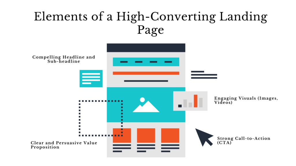
Compelling Headline and Sub-headline
The headline is the first element visitors see and plays a crucial role in capturing their attention. A compelling headline should be clear, concise, and convey the main benefit of the offer. The subheadline supports the headline by providing additional context or highlighting key features.
Clear and Persuasive Value Proposition
The value proposition explains why the visitor should take the desired action. It should be clear, specific, and highlight the unique benefits of the offer. A strong value proposition answers the question, “What’s in it for me?”
Engaging Visuals (Images, Videos)
Visual content enhances the appeal of a landing page and helps convey the message more effectively. High-quality images, videos, and infographics can capture attention, explain complex concepts, and build trust.
Strong Call-to-Action (CTA)
The CTA is the most critical element of a landing page. It should be prominently displayed, use action-oriented language, and create a sense of urgency. Phrases like “Get Started Now,” “Claim Your Free Trial,” or “Download Today” encourage immediate action.

Design Best Practices
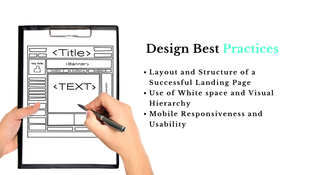
Layout and Structure of a Successful Landing Page
A well-structured landing page guides visitors through the content seamlessly. Use a clean and organized layout with a clear hierarchy. Place the most critical elements above the fold to ensure they are visible without scrolling.
Use of White space and Visual Hierarchy
Whitespace helps to create a clean and uncluttered look, making the content more readable. Visual hierarchy ensures that the most important elements, such as the headline and CTA, stand out and draw the visitor’s attention.
Mobile Responsiveness and Usability
With the increasing use of mobile devices, it’s essential to ensure that landing pages are mobile-friendly. Use responsive design techniques to ensure the page looks and functions well on all screen sizes. Test the page on various devices to ensure a seamless user experience.

Crafting Persuasive Copy
Writing Effective Copy for Landing Pages
The copy on a landing page should be clear, concise, and focused on the benefits of the offer. Use simple language and avoid jargon. Highlight the key benefits and features that address the visitor’s needs and pain points.
Techniques for Highlighting Benefits and Addressing Pain Points
Focus on the benefits rather than just the features. Explain how the offer solves a problem or improves the visitor’s situation. Use bullet points to make the benefits easy to scan. Address common objections and provide solutions to potential concerns.
A/B Testing Copy Variations
A/B testing involves creating two versions of a landing page with slight variations in the copy to see which performs better. Test different headlines, CTAs, and value propositions to determine what resonates best with your audience. Use data from these tests to optimize your copy continuously.

Optimizing Forms for Conversion
Designing User-Friendly Forms
Forms should be easy to complete and ask for only the necessary information. Use a single-column layout, clear labels, and sufficient spacing between fields. Ensure that the form is visually appealing and aligns with the overall design of the landing page.
Reducing Form Friction and Increasing Completion Rates
Reduce friction by minimizing the number of fields and using autofill options. Provide clear instructions and use microcopy to guide users through the form. Highlight the benefits of completing the form to motivate users.
Implementing Progressive Profiling
Progressive profiling involves collecting information gradually over multiple interactions. Instead of asking for all the details at once, gather essential information first and request additional data in future interactions. This approach reduces form abandonment and enhances the user experience.
Implementing Trust Signals
Importance of Trust Elements (Testimonials, Reviews, Trust Badges)
Trust signals help build credibility and reassure visitors that the offer is legitimate. Include customer testimonials, reviews, case studies, and trust badges (e.g., security seals, industry certifications) to enhance trust.
Strategies for Building Credibility on Landing Pages
Use real photos of customers and include their names and affiliations to make testimonials more authentic. Display logos of well-known clients or media mentions. Ensure that all trust signals are prominently displayed and easily visible.

Using Visual Content Strategically
Incorporating Videos, Images, and Infographics
Visual content can make a landing page more engaging and informative. Use videos to explain the offer, showcase product demos, or share customer testimonials. Images and infographics can illustrate benefits and simplify complex information.
Guidelines for Optimizing Visual Content for Conversion
Ensure that visual content is high-quality and relevant to the offer. Use descriptive alt text for images and captions for videos to improve accessibility and SEO. Optimize the file size to ensure fast loading times.
Testing and Optimization
A/B Testing Elements of Landing Pages
Regularly conduct A/B tests on various elements of the landing page, such as headlines, images, CTAs, and forms. Use the insights gained from these tests to make data-driven improvements.
Analyzing Metrics and Making Data-Driven Decisions
Track key metrics such as conversion rates, bounce rates, and time on page to assess the performance of your landing pages. Use analytics tools to gather data and identify areas for improvement.
Continuous Optimization Strategies
Landing page optimization is an ongoing process. Continuously test new elements, analyze results, and implement changes to enhance performance. Stay updated with industry trends and best practices to ensure your landing pages remain effective.
Integrating Landing Pages with Digital Marketing Campaigns
Aligning Landing Pages with Campaign Goals and Messaging
Ensure that your landing pages align with the overall goals and messaging of your marketing campaigns. Consistency in messaging across all channels (ads, emails, social media) reinforces the campaign and enhances the user experience.
Examples of Successful Landing Page Campaigns
Analyze successful landing page campaigns to understand what worked well. Look for examples in your industry and identify the key elements that contributed to their success. Use these insights to inform your own landing page strategies.
Advanced Strategies for Higher Conversion Rates
Personalization Tactics for Landing Pages
Personalize landing pages based on user data and behavior. Use dynamic content to tailor headlines, images, and CTAs to different audience segments. Personalization can significantly increase engagement and conversion rates.
Retargeting Strategies Using Landing Pages
Use retargeting ads to bring back visitors who didn’t convert on their first visit. Create specific landing pages for retargeted visitors with customized offers or incentives to encourage conversion.
Compliance and Privacy Considerations
GDPR and CCPA Compliance for Landing Pages
Ensure that your landing pages comply with data protection regulations like GDPR and CCPA. Provide clear information about data collection and use, and obtain explicit consent from users.
Best Practices for Handling User Data
Handle user data with care and ensure it is stored securely. Use encryption and other security measures to protect sensitive information. Be transparent about your data handling practices and provide users with options to manage their data.
Case Studies and Examples
Successful Case Studies of High-Converting Landing Pages
Review case studies of high-converting landing pages to learn from real-world examples. Analyze the strategies used, the challenges faced, and the results achieved. Apply these lessons to your own landing page efforts.
Lessons Learned from Real-World Examples
Identify common themes and best practices from successful landing pages. Look for patterns in design, copy, and user experience that contribute to high conversion rates. Use these insights to refine your own landing page strategies.
Future Trends in Landing Page Optimization
Emerging Technologies and Trends in Landing Page Design
Stay updated with emerging technologies and trends in landing page design. Innovations such as AI-driven personalization, interactive content, and advanced analytics tools are shaping the future of landing pages.
Predictions for the Future of High-Converting Landing Pages
Expect continued advancements in personalization, user experience, and data-driven optimization. As technology evolves, landing pages will become even more effective at converting visitors and achieving marketing goals.
Conclusion
Recap of Key Strategies for Creating High-Converting Landing Pages
Creating high-converting landing pages involves a combination of compelling design, persuasive copy, and strategic use of visuals and trust signals. Regular testing and optimization are essential for maintaining and improving performance.
Final Thoughts on the Importance of Continuous Optimization
Continuous optimization is crucial for staying ahead in the competitive digital marketing landscape. By regularly testing, analyzing, and refining your landing pages, you can achieve higher conversion rates and drive greater success in your marketing efforts.
FAQs
How do I create an effective call-to-action (CTA) on my landing page?
To create an effective CTA, use clear, action-oriented language that tells visitors exactly what to do, such as "Download Now" or "Get Started Today." Ensure the CTA stands out visually with contrasting colors and prominent placement on the page. Additionally, creating a sense of urgency can encourage immediate action.
Why is mobile responsiveness important for landing pages?
Mobile responsiveness ensures that your landing page looks and functions well on all devices, including smartphones and tablets. With an increasing number of users accessing the internet via mobile devices, a responsive design improves user experience, reduces bounce rates, and enhances conversion rates.
What are some common elements of a high-converting landing page?
Common elements include a compelling headline and subheadline, a clear and persuasive value proposition, engaging visuals (such as images and videos), a strong CTA, user-friendly forms, and trust signals like testimonials and reviews. Each of these components plays a crucial role in capturing attention and encouraging conversions.
How can I optimize forms on my landing page to increase conversion rates?
To optimize forms, keep them simple and only ask for essential information to reduce friction. Use clear labels and provide autofill options to make the process easier for users. Progressive profiling, which involves collecting information over multiple interactions, can also help reduce form abandonment and improve completion rates.
What role do trust signals play in enhancing landing page conversions?
Trust signals, such as customer testimonials, reviews, and trust badges (e.g., security seals and industry certifications), build credibility and reassure visitors of the legitimacy and value of your offer. Including these elements on your landing page can increase visitor confidence and boost conversion rates.


